Silk Screenprints
Printmaking and Illustration
Silk Screenprints
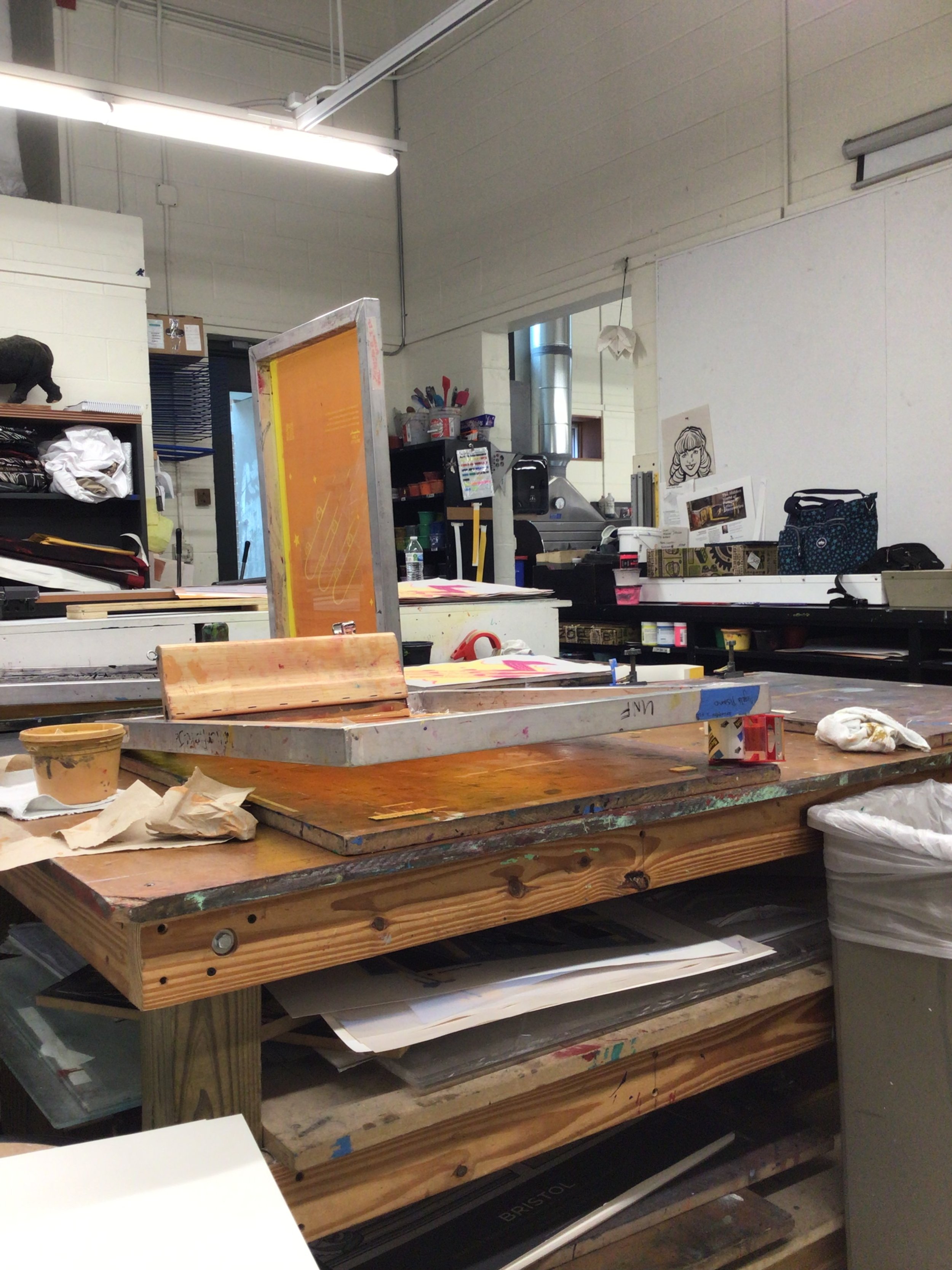
Printmaking is a messy, hands-on medium requiring a meticulous process to create clean prints. My screen prints are a combination of illustration and graphic design. Below are prints of many different sizes including letter, tabloid, and poster, made with different techniques such as reduction, stencils, and half-tone film process.
Print Types:
One-layer prints
Reduction prints
Poster prints
One-layer Prints
Keepin’ it simple
A big question you need to ask before screen printing is how to simplify the design into the least amount of layers. My one-layer print is exactly that, one layer with the entire design printed onto paper. Simplicity allows experimentation with different colored inks and paper.
One layer on 8.5in. x 11in. 60lb paper
Matte Ink
Metallic Ink
Reduction Prints
It’s kinda confusing to explain.
The process of “reduction screen printing” is when a multi-layered print is made using a single screen. Screen filler is painted onto the screen to block out portions of the design and the process is repeated until the final look is achieved. For example, the areas painted for the first layer will be your paper color. Then you paint more and more filler onto the screen for each layer; reducing the amount of unfilled screen until the desired design is achieved.
Four to five layers on 11in. x 14in. bristol board
Layer 1: Leaving Whitespace
Layer 2: Face Reveal
Layer 3: Face Contour
Layer 4 (final): Depth and Shadows
Layer 5 (bonus): One with a little extra sparkle (metallic ink)
An Array of Multifaceted Faces
Charity Poster Prints
Working at a large scale
Prints are an effective way to mass produce a design advertising a festival, concert, or charity event. This poster advertises Little Free Libraries’ program “Read in Full Color”. It is an initiative striving to share children's books following protagonists of all genders, ethnicities, and identities because less than 25% of children’s books depict non-white characters.
Bright saturated colors, playful organic lettering, and supplemental imagery support the idea that reading is foundational. For the next generation to cultivate their heart, mind, and soul, they need to see themselves represented in the books they read.
Three layers on 19in. x 25in. french paper
Its easy as 1, 2, 3
Final Design
SAD Food Poster Series
You Are What You Eat
Growing up in the early 2000’s, I watched my fair share of wacky, colorful, and outrageous commercials marketing the newest junk food on the market. No matter how nostalgic, there is no way these foods were nourishing for kids. Surge, Trix, Hot Cheetos, and Dino Nuggets are foods explored in this poster series.
Graphic design and illustrations are combined to convey satirical and enlightening messages behind the marketing tactics, slogans, and verbiage used in the advertisements, commercials, and packaging for these foods.
Two to three layers printed on 18inx24in white bristol board and kraft brown paper.
Surge: M.D.K (Mountain Dew Killer)
Trix Yogurt: Silly Rabbit
Hot Cheetos: Dangerously Cheesy
Tyson Nuggets: Dino Meat Not Included
Halftone Print
“Cause I Want Some More”
This print is inspired by J-Hope’s song More from his Jack in the Box album which is a blend of grunge and hip-hop. Introspective lyrics ask how to maintain a passion that is causing innerturmoil and a distorted sense of self. Hand written lyrics surround the photo-manipulated skull collage turned into half-tones and printed on to film.
Two layers on 11in. x 14in. white and kraft brown paper.